I pushed a small update to our getting started sample for creating modal UI for XD plugins.
When you run this plugin, here’s what you’ll see:
In addition to keeping the samples up to date with the latest APIs, this specific sample may be used in a plugin bootstrapper tool soon, so we wanted to make sure the sample is setting developers down the right path.
While I was playing around with the code, I was reminded of a few basic points to keep in mind when creating modal dialog UI for XD plugins. It’s a bit of a grab bag, but I’ll share them here in hopes that it’s useful.
Note that everything below is current as of XD 24, but APIs can always change so refer to the docs for the latest.
Make your dialog headings look nice
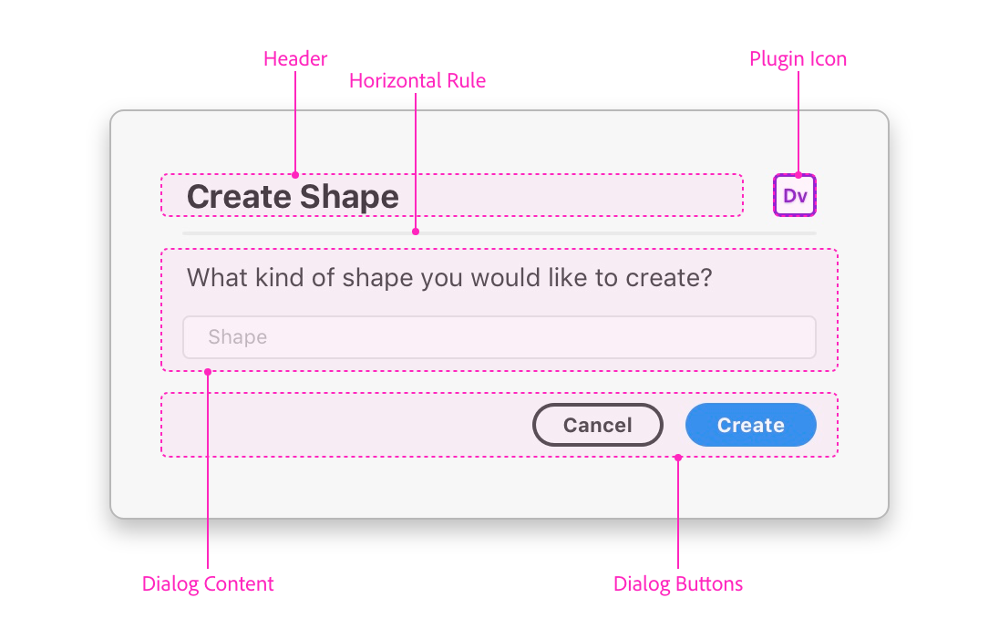
The plugin design guidelines for modal dialogs recommend that standard modals have an h1 heading and the plugin icon on a single line, followed just underneath by a horizontal rule.
From the plugin design guidelines, here’s the basic anatomy of a modal dialog:

The HTML for the heading would look something like this:
<h1>
	<span>Hello HTML!</span>
	<img class="icon" src="images/icon@1x.png">
</h1>
<hr />
This would be styled by CSS along these lines:
h1 {
display: flex;
align-items: center;
justify-content: space-between;
}
.icon {
width: 24px;
height: 24px;
overflow: hidden;
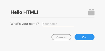
}Resulting in something like the heading you see here:

It’s certainly not a requirement to do things this way, but it’s a nice look for plugins that want to follow the standard pattern.
Flexbox is your friend
You may have noticed that the code sample above is using CSS flexbox layout to achieve the desired layout for the heading and icon.
Flexbox is a powerful tool for creating great layouts that would otherwise be a chore. UXP, the technology platform that powers XD plugin UI (among other things), supports flexbox, meaning you can bring any flexbox skills you have with you when creating an XD plugin.
But I’ll admit that until recently, flexbox was something of a confounding black box for me, having only hacked at it for small things here and there in isolation. Not long ago, I ran through Wes Bos’s What the Flexbox course over an afternoon and got up to speed sufficiently to get things done.
While flexbox isn’t required to build an XD plugin, it can certainly help when you’re crafting your plugin UI layout.
Form label/input markup deviates a bit from standard HTML
I saw this in the existing sample code and instinctively started to correct it:
<label>
    <span>What's your name?</span>
    <input uxp-quiet="true" type="text" id="name" placeholder="Your name"/>
</label>
Usually in HTML, you’d expect to have the label and input be siblings, giving the label a for attribute that equals the input’s id.
However, due to known issue in the API, the above code sample is actually the current correct way to write a label/input in your plugin markup. Not a big adjustment to make, but something to keep in mind if you’re experiencing layout issues with these specific elements.
Take advantage of UXP magic for form buttons
I’ve seen a lot of these over the last year:
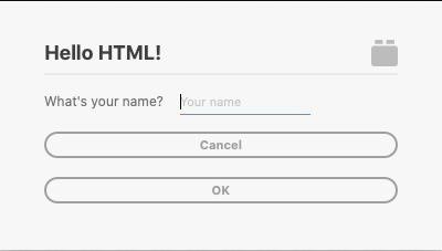
Those are greedy buttons attempting to take up as much width as possible, and not looking intentionally styled.
These buttons are missing out on some of the magic that UXP gives you for free:

What you’re getting in the above example is a UX/UI pattern that matches what users expect from standard XD plugins, styles and behavior included.
Here’s how you get it:
<dialog>
    <form method="dialog">
        <!-- your markup here -->

        <footer>
            <button id="cancel">Cancel</button>
            <button type="submit" id="ok" uxp-variant="cta">OK</button>
        </footer>
    </form>
</dialog>
That’s a footer with a couple of buttons inside of it (you can have one or more buttons here) at the end of your form. Note that the call-to-action button has the uxp-variant="cta" attribute on it.
That’s really it. No CSS or JavaScript required. Unless you have very specific plans for your modal buttons, this is the way to go.
Hopefully this handful of tips on creating modal dialog UI for XD plugins is helpful.
Don’t forget to check out the docs, and grab the sample here.