
When users launch an XD plugin that provides modal dialog UI, the UI appears above the document and blocks interaction until it is dismissed. For the user, being able to dismiss your plugin’s modal is important; otherwise, your plugin will make users feel stuck, at worst leaving them wondering if you have locked them out of the app.
There can be multiple ways for a user to exit a modal plugin, and for your plugin’s code to handle those exits. Let’s take a look.
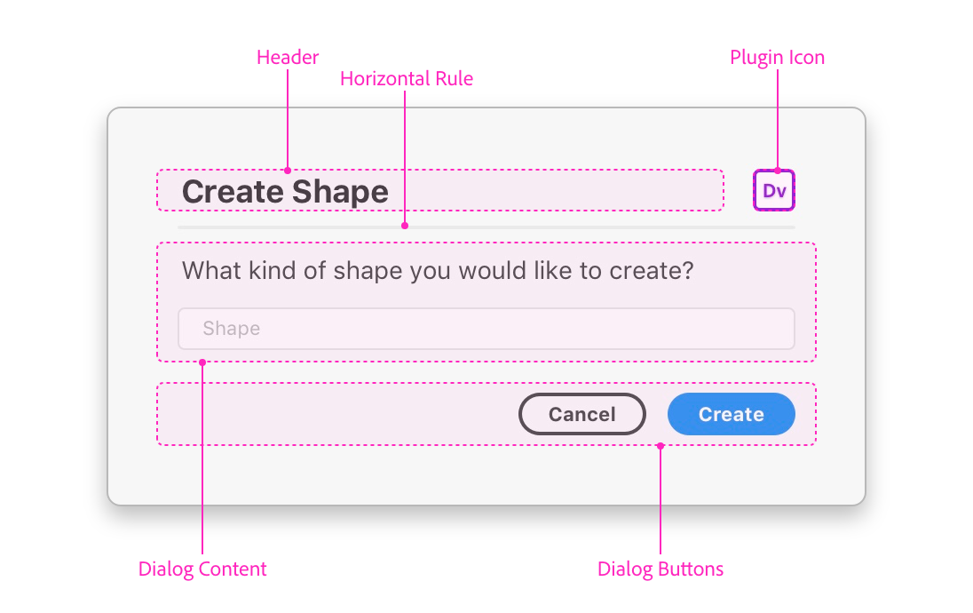
Note that I’m only going to show JavaScript below. Where buttons are concerned, if you’re wondering how to structure your HTML to achieve the right look and feel see “4 tips for creating XD plugin modal UI”.
The escape key as a default
Most OSes (and even many websites) let users dismiss modal UI with the escape key.
The same holds true for XD plugin modals: the escape key allows users to dismiss your modal at any time. This is not configurable at the API level, and is an exit scenario that you should be aware of.
When the user hits the escape key, XD calls this for you:
dialog.close("reasonCanceled");In turn, that means you can handle a user’s exit via the escape key with something like this:
// `result` is the string passed via `dialog.close()`
// which XD calls for you when the user hits the esc key
const result = await dialog.showModal();

if (result === "reasonCanceled") {
    // The user canceled the modal with the esc key

} else {
    // The user exited the modal another way

}
While the escape key is available for users to close the modal dialog, not all users will be aware of it. For all published plugins, Adobe requires that you provide an affordance in the modal UI for dismissing the modal.
Below we’ll look at a few common affordances.
A confirmation button
If your modal is serving as an alert (“Task completed!”, “Something’s wrong!”), you may only need a confirmation button:
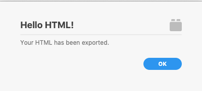
In this case, your handler code could be as simple as this*:
const ok = document.querySelector("#ok");
ok.addEventListener("click", () => dialog.close("ok"));
*But you’ll want to read on if you want to handle
onsubmitevents in addition to clicks.
This is simply passing back an ”ok” message from dialog.close(), but it could be any arbitrary string (or none; this string is optional!).
A cancel button
Cancel buttons are often useful when paired with an execution button (which we will look at in the next section). Like the escape key, a cancel button gives the user a way to exit the plugin modal without executing any action through the plugin.
At the code level, you can handle the cancel like this:
const cancel = document.querySelector("#cancel");
cancel.addEventListener("click", () => dialog.close("reasonCanceled"));
As you can see in the code above, I tend to find that it’s handy to align my own cancel button message string with the one returned by XD itself when the user presses the escape key (”reasonCanceled”). This way, I can handle either variety of canceling in the same way.
This alignment of message strings isn’t required; you can pass any arbitrary string to dialog.close(), or none at all.
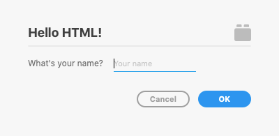
Execution and cancel buttons
In many cases, the modal dialog serves to let a user configure settings then execute a task.
Depending on your plugin UI design, your buttons can take different forms, but the suggested pattern (and the one that users will be most familiar with) is the one modeled in the plugin design guidelines for modal dialogs:
If you go with this pattern, you can handle it in JavaScript by combining the two approaches in the previous sections:
const [cancel, ok] = ["#cancel","#ok"]
    .map(s => document.querySelector(s));

ok.addEventListener("click", () => dialog.close("ok"));
cancel.addEventListener("click", () => dialog.close("reasonCanceled"));
If you tried this but aren’t getting back the ”ok" message as expected, it might be because you have the type=“submit" attribute on your ok button. We’ll handle that next.
Handling submit events
Finally, you’ll most likely want to handle your form’s onsubmit event as well, for when the user hits the enter/return key while focused on an input.
In a basic 2-button scenario like this one (i.e., cancel/execute), I tend to handle both the execute button and form.onsubmit with the same handler function, for simplicity:
const [cancel, ok, form] = ["#cancel","#ok", "form"]
    .map(s => document.querySelector(s));

cancel.addEventListener("click", e => dialog.close("reasonCanceled"));
ok.addEventListener("click", e => handleSubmit(e);
form.onsubmit = e => handleSubmit(e);

function handleSubmit(e) {
    dialog.close("ok");
    // Prevent further automatic close handlers
    e.preventDefault();
}
That final e.preventDefault() call is important for ensuring that your close handler is called only once (instead of for both “click” and “submit”) and at the right level to ensure your close message gets through.
That’s all for this one. Hopefully you feel more in control of handling your exits for XD plugin modal dialog UI.
Again, if you’re wondering how to structure your HTML to achieve the right look and feel for the buttons you’ve seen here, have a look at “4 tips for creating XD plugin modal UI”.
All of the plugin JavaScript code above is based on this modal UI sample on GitHub.